Thursday, October 26, 2006

Dare #10 - Marieke


I obviously haven't been scrapping long enough because I don't have any templates lol, but I do have an abundance of chipboard letters... so I used the negative space of some Heidi Swapp letters and cut around the letters to create an outline of the letters in the word T-shirt.
Journaling reads: Being on a fairly tight budget means we can't buy all the beautiful clothes at Pumkin Patch and such. But look what I can do with scrap supplies!
Annabel adores this t-shirt! She told me it was her 'best favourite ever ever'. I just bought a plain cheap t-shirt for less than $5 and added ribbons, flowers and buttons from my stash.

Monday, October 23, 2006

Dare # 10 - Lianne

For the words 'YUM' I used the lettering template to trace the letters onto cardstock with pencil, then 'painted' them with bleach, and then stitched over the pencilled lines with the red thread. You can't really see but inside the stitching the c/s is lighter from the bleach and a bit blobby over the lines. I love using bleachand the different effects you can get, kinda like batik, and in case you're wondering, yes it's fine to use with your photos. It's actually a base, which is the opposite of an acid. In it's liquid form it is unsafe but as the bleach dries, it becomes inert (neutralizes) and is safe to use in your scrapbooks.
This was fun you know trying to think of different things to do with the templates. Use as a mask, painting over them, greeeeat with texture paste (I tried that too), tracing and painting, stitching, and I'm sure there's more. Anyway here's lots of ideas for you to use to come up with something really cool and we'd of course love to see it.

This fortnight’s dare is kindly sponsored by Scrapbook Essentials. Thanks to Meg for her support. Remember to link us to your online gallery or blog in the comments section please - or email a pic to RANDLGRAY@xtra.co.nz (100kbs or less) by Wednesday the 1 November by 6pm.

Something really exciting is happening soon too.

Sunday, October 22, 2006

Dare 10 - Trina


Lettering templates. Wow, now that's a hard one!
I used mine as a mask. I put texture paste through the letter and then pulled the template off. This left a nice raised 3D letter.

Once it was dry, I highlighted it with red and purple metallic rubons/ink to give it a marbled look.

I hope you all have fun getting out those old templates and giving it a go.

Saturday, October 21, 2006

Dare 10 - Lesley


I have taken an upper case and lowercase of the same font. With the uppercase template I traced 'SPLASH' onto acetate with a slick marker and then cut out the letters. I have overlapped them slightly and attached with a vellum photo split. With the lower case template, I first stamped a circle on shrinky dink and then traced the letters in the middle and coloured them in. I then cut out the circle and shrunk the plastic. It was great fun dusting off some old supplies and using them. I dare you to!

Lesley

Friday, October 20, 2006

Dare #9 entries

Oops, I see Faye has already posted our next dare (see below). But I didn't want you to miss out on this eye candy. Honestly, don't envy us. You all make it so HARD every time. Wonderful layouts again! Thank you so much sharing with us.


Dare # 10

We all have them, old lettering templates lurking in the back of the cupboard or under the desk. This fortnight's DARE is to show us the 'creative use of your lettering templates' - get out your old lettering templates and use them on a layout in a creative and interesting way. I took mine and used them as a mask. I painted over some of them straight onto chipboard for the larger title then the "no" was painted directly onto my layout.

This fortnight’s dare is kindly sponsored by Scrapbook Essentials. Thanks to Meg for her support. Remember to link us to your online gallery or blog in the comments section please - or email a pic to RANDLGRAY@xtra.co.nz (100kbs or less) by Wednesday the 1 November by 6pm. Have fun!

Thursday, October 19, 2006

25 entries!!! And a winner is ...

Margaret Bennett
with her "A little bit country".Love the combo of orange/green and brown. Journaling around the scroll reads: Hitch your haywagon to a bright star...." This layout has a very country feel.
Well another awesome lot of layouts to browse through. 25 entries! Go girls!!!! And so hard to choose ONE winner! So congratulations Margaret and thanks again to Andrea from ScrapbookOutlet for donating the prize for this dare - some yummy MayaRoad goodies are coming your way Margaret!
And thanks to everyone who took up the challenge of this dare - next dare will be posted tomorrow and promises to be a goodie! So check back tomorrow for some Labour weekend inspiration!

Thursday, October 12, 2006

My take on the orange and green challenge

.. .and only 6 days late. *blushing Background is Making Memories. The dots look white in this picture but they look more light green IRL. I used the template of some Heidi Swapp chipboard letters as a photomat. Strip under the title is Provo Craft (green, orange and pink). Oh yeah and a little Sassafrass die-cut on one of the large photo corners.
This is a layout celebrating my little girl beginning to recognize her letters and numbers.


Hmm, looking at it now it seems a bit crooked. It's straight IRL, really!

Tuesday, October 10, 2006

Dare 9 - Lesley


I love colour. When given this challenge I looked at my trusty colourwheel and saw that good combinations with orange and green were red, blue or purple. So I chose hot pink! And I have used a very lime green. To tone it all down I have used green and orange distress ink. I love these colours with my black and white photo.

Lesley

Monday, October 09, 2006

Dare 9 - Trina's take


So here is my take on orange and green. I love orange and find I actually use it quite alot. Not a colour I really thought I would use heaps of but hey, there you go....

The PP is by Chatterbox, ribbon, Junkitz ribbon tie, thread, prima flowers, and a couple of chipboard alphas. Throw in a few embellishments from the good ole 'red shed' (The Warehouse) and thats my LO.

These are older photos of the twins enjoying their tummy time. They always did love it and had really strong heads, holding them up from an early age. I wanted to get these done now before I forgot which photo was which twin. LOL. Yes it can happen even if they aren't identical.

Lianne - Dare # 9

Orange, green and brown. It's a pity the scan has cut off the edges - there is orange paint right around the edges and the green stitching goes right around too.
I love these photos of my pussy cat with her cute little paws hanging over the branch. I've used Scrappin NZ ponga fern paper which sets the mood of the tree nicely and Bohemia p/p's and bird die cut. You can't see it but the green flower is covered in glitter. Punch out jac paper and coat in fine glitter. Looks bootiful IRL.
This fortnight’s dare is kindly sponsored by Scrapbook Outlet. Thanks Andrea!

Remember to link us to your online gallery or blog in the comments section please - or email a pic to RANDLGRAY@xtra.co.nz (100kbs or less) by Wednesday the 18th October by 6pm.

And if you haven't already, read Yolandes post for info on Colour.

Sunday, October 08, 2006

Dare 9 - Faye


Orange, green and purple, my favourite colour combination. It always amazes me how well these colours go together. Started with a sheet of Bazzill, added a MOD paper and 2 other patterned papers from my stash, then I used decorative scissors to add some interest. HS chipboard letters, MM small letters and an AL rubon for the bird. The tiny arrows are clear stamps from Sassafras Lass. I had fun with this one.

Saturday, October 07, 2006

Dare 9 - Andrea

For my layout I chose red to go with green and orange. I love these colours - so bright and cheery and went really well with these pics. I've used SEI paper, Bohemia transparency frame from My Minds Eye, Fontwerks (alphas) and Catslife Press (play) stamps, and some cute ricrac i got from Spotlight. The date is done using a digital brush by Rhonna Farrer and printing it onto cardstock.

Thanks to Scrapbook Outlet for this week's prize. Looking forward to seeing all your entries!

Friday, October 06, 2006

Dare #9

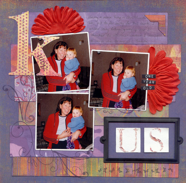
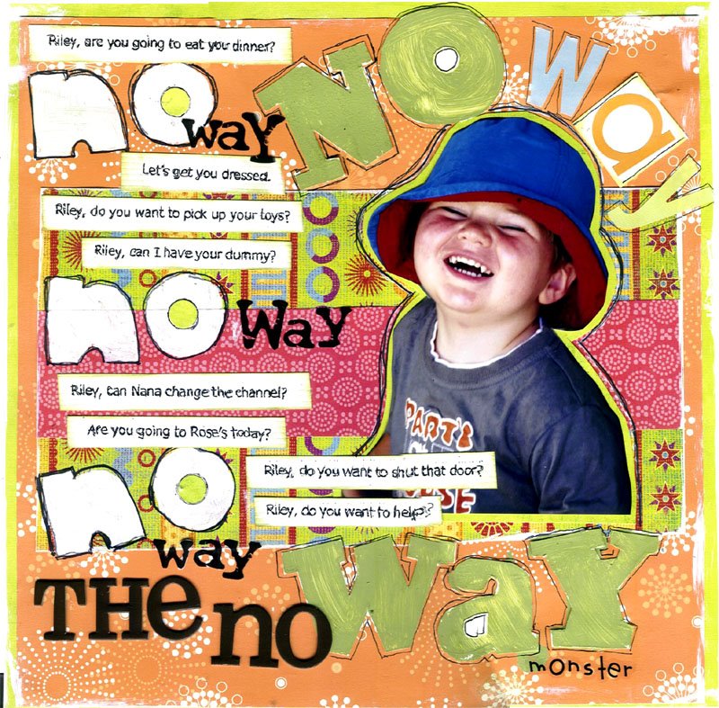
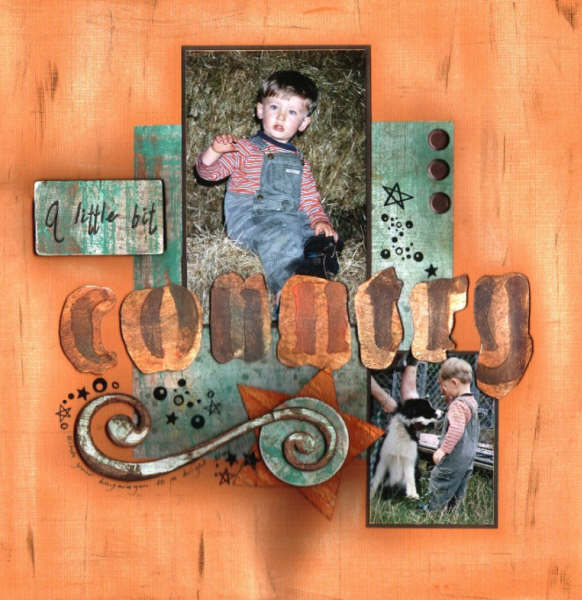
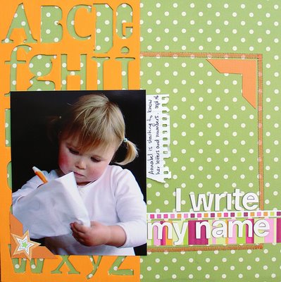
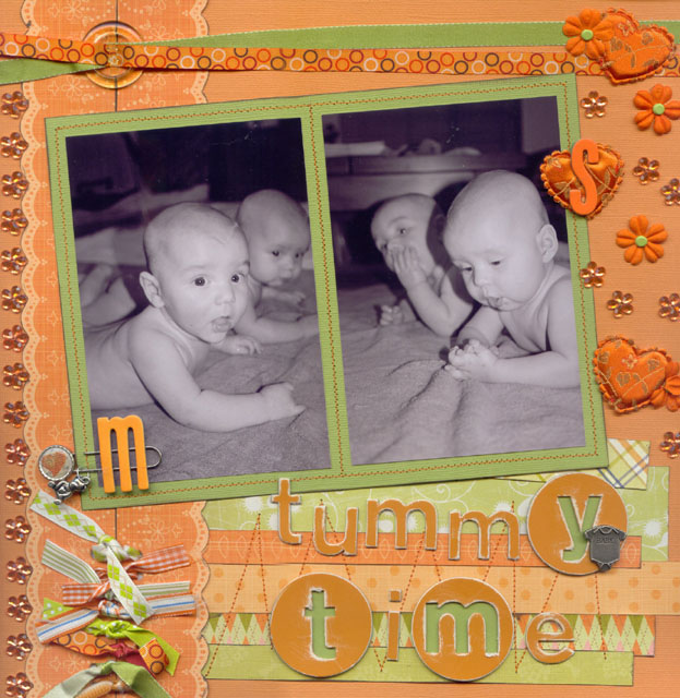
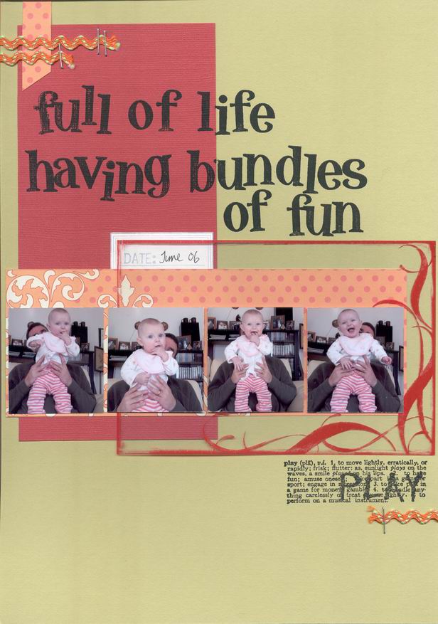
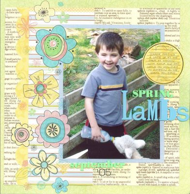
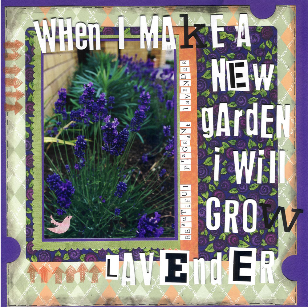
**COLOUR Challenge**
Orange and Green plus ONE colour
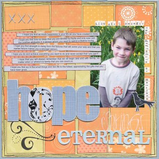
I have a fondness for orange pattern paper. After looking in my stash I discovered I have been “collecting” it! So this is my challenge – don’t be afraid of colour! I challenge you to use orange and green together and you get to ADD one other colour of your choice (except black and white but this can be used for text and small embellishments)
No white or black cardstock backgrounds for me was a push outside my comfort zone but I loved the challenge! I hope you enjoy this one too!
This fortnight’s dare is kindly sponsored by Scrapbook Outlet and the prize is some Maya Road goodies (YUM!) Thanks Andrea!
Remember to link us to your online gallery or blog in the comments section please - or email a pic to RANDLGRAY@xtra.co.nz (100kbs or less) by Wednesday the 18th October by 6pm.

And a bit of interesting reading for you!
The meaning of colour! {taken from http://www.color-wheel-pro.com/ }
Orange
Orange combines the energy of red and the happiness of yellow. It is associated with joy, sunshine, and the tropics. Orange represents enthusiasm, fascination, happiness, creativity, determination, attraction, success, encouragement, and stimulation.
Orange has very high visibility, so you can use it to catch attention and highlight the most important elements of your design.
Green
Green is the colour of nature. It symbolizes growth, harmony, freshness, and fertility. Green has strong emotional correspondence with safety. Dark green is also commonly associated with money. Green is the most restful colour for the human eye; it can improve vision. Green suggests stability and endurance.

Look forward to seeing the creations this time. Enjoy the challenge!

Thursday, October 05, 2006

All the entries for dare #8

Thank you so very much for participating again this time. We received a whopping 21 entries! It was hard to choose. See for yourselves:

And the winner of Dare # 8 is ...

Megan Renfree
with this fantastic example of Flowers on a Boy page. Just gorgeous Megan.
W e had some amazing entries which made it so hard to choose. Thank you to everyone who did the Dare. We have another cool one for you tomorrow night so look out for it.
Congratulations Megan and thanks again to Kiwiscraps for sponsoring Dare # 8.
I'll email you Megan and we'll arrange delivery of your prize. Yehaa.

Monday, October 02, 2006

Dare #8 -Yolande

Ok better late than never! This is my son who is totally fascinated by nature! The flower is made from metal sheets. Scan has chopped off the bottom sorry!
Thanks again to Kiwiscraps for the prize for this dare! There is still time to get it done by Wednesday!