Dare 34 - Alter a Photo Digitally
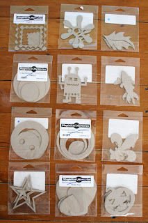 Personally I am in love with the robot/alien. Thanks so much for your support!
The challenge? Make a layout using a photo you have altered digitally. Now you don't need to be a Photoshop whizz to do this. For example, you could use a free program like Picasa (which is free) to turn your photo black and white or sepia or add a nice glow at the touch of a button or two. You could use Microsoft Paint. If you want to try something a little more challenging, download the trial version of Photoshop Elements - you get 30 days to try it out. Microsoft have a free progam you can download that lets you combine several images for the perfect group shot. Have fun and have a play - we dare you!!
Irene is our guest designer this week and her awesome layout is below:
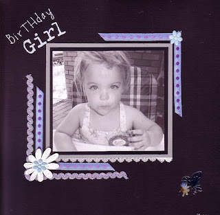 And here are ours:
Sharon:
I used Photoshop Elements to selectively colour the photos. I have posted a tutorial on my blog if you want to see how I did it.
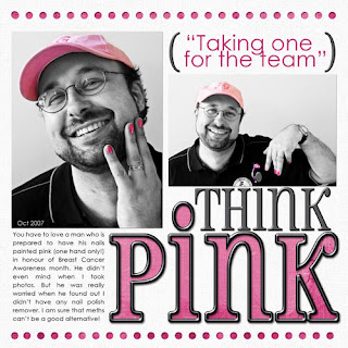 This photo is actually a combination of two (someone always has to make a funny face). I also used this tutorial to get a bit more "punch" in the photo.
  Donna:
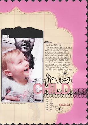
I have Microsoft Digital Image and used a Diffuse Glow filter to alter my black & white image. The original photo made my daughter's skin look really blotchy and I'd avoided scrapping it, but I love the new softer version!
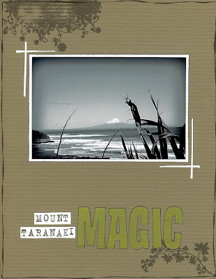
Jo - I am totally in awe of the work of Jessica Dittmer (go here: http://www.wishyouwellsonline.com/main.html to see her stuff) and wanted to have a go and see if I could get a halfway decent approximation of what she does. Anyway, the photo in this layout is the result...
 And here is the original so you can see the difference.
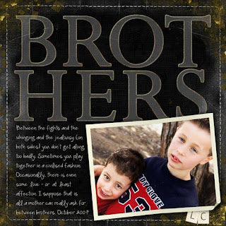
Monique - My layout was made using the very basics...I love this photo but the boys faces were in shadow so I lightened and brightened it a bit with my computers photo editing software...then I drew the little telephone embellishment onto the photo using Microsoft paint (and if this techno challenged person is right, I think all computers have this!) Once the photo was printed I I sliced around one edge of the telephone with my craft knife so the journaling box could be slipped under it….hardly fancy stuff!!! but using paint to draw on the photo was a lot of fun, and I can see myself using it again to create my own doodle effects.
Lesley - I have used photoshop elements to add a digital brush (from the Joni set 17). I have added a white frame to each of my photos.

Vicky- Im not much of a digi scrapper but i do edit most of my photos. I use photoshop and for this photo i ran a colour pop action on it (sorry i cant remember where i got it from) then played with the levels and curves until it was 'just right'.
Lianne - I used a photoshop action called Professional Retro from here:
and I've also added the original photo.
 Andrea
I made 2 copies of the photo. On one I added a colour pop action and also adjusted the brightness and contrast, then I added an Accented Edges filter which gives it a painted look but with kind of glowing edges as well. On the second copy I added a Graphic Pen Filter. Then I layered the 2 copies together with the Graphic Pen copy on top and erased the layer over Isla to show the Accented Edges copy through. I've added the original photo to so you can see the difference.
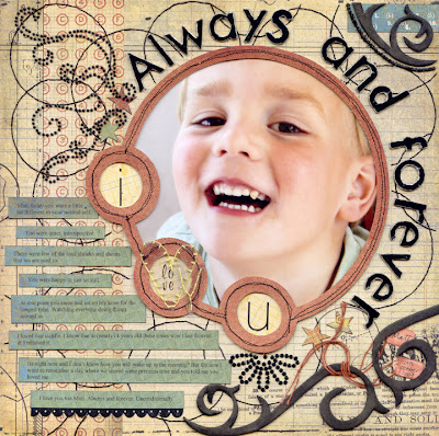
 HI! Trina here with my take on this fortnights dare. And it was a great one to challenge me again. With this photo I lightened it, brightened it, adjusted the curves and contrast. I also enlarged it to 8x10 before cutting it to fit the circle. And on top of that for the LO itself I used some gorgeous chipboard from Magistical Memories. What I used is that cool big round frame, with the three little circles. Its called "Outside the bubble".
Here is my LO and the original photo.


24 Comments:
This comment has been removed by the author.
Sorry the above link dosent work heres a new one
http://4carol.blogspot.com/
Great Layouts & an awesome dare. I better get my thinking cap on. lol
Those are wonderful layouts.
I have completed a layout where I kept a single colour on the photo & made the rest B & W.
http://katrinanz.blogspot.com/2007/11/altered-photo-layout.html
I have just finished this LO, i have just started playing with altered photos so i have a few lol
hope its ok to do more than one.
http://4carol.blogspot.com/
Hi Axel,
Hey thats cool that you've been inspired to do more than one! We often get multiple entries, so as long as it fits the dare criteria we'd love to see them all!
Go you!!!!!!!
This comment has been removed by the author.
So here's my first dare layout.
I fixed the levels etc on the older photos and then reapplied a sepia filter to them. On the bigger photo I layered a sepia toned photo on top of the original colour photo to tone down the green in Mum's top.
Courage - Spirit - Love
http://www.digitalscrapbookplace.com/gallery/showphoto.php?photo=224352
Here's mine!! I altered the main pic by taking the background colour out, and adding a digital frame.
http://www.scrapinstyletv.com/portfolio/view_layout.php?layout_id=48193&user_id=1956
Thanks for looking,
Lee L :)
Wonderful layouts ladies, I'm just in awe of the work behind these ones. Lianne, that is an amazing shot. What a great photo.
There are some great layouts so far - keep them coming :)
It´s Monday and I feel tired anyway. I was looking for inspiration so I visit your blog. I really enjoy looking at others work. Thank you for sharing it with the rest of the world.
My take is on my blog I used paint net to alter the photo
http://fifiscrapz.blogspot.com/
here's mine!
https://twopeasinabucket.kaboose.com/pg.asp?cmd=display&layout_id=1260439
Here is mine. http://farm1.static.flickr.com/230/502930975_d5568eb23a_o.jpg It's an older layout but I love it. The mini filmstrip frame is from Magistical Memories.
hmm, I don't think my LO is in the slideshow...here it is again..
http://www.scrapinstyletv.com/portfolio/view_layout.php?layout_id=48193&user_id=1956
THANKS,
Lee :)
doh, never mind, I realised i was looking at the SS for the previous challenge...LOL. ignore me, back to your normal programming... :P
Cheers,
Lee :)
Bucket I can't see your LO, do you have another link?
Heres another i did, thought i had better give you the names of the entries to lol.
They are loaded on my blog.
Pisces, Happy ever after and charmed ones. thanks ladies, iv had so much fun doing this :)
Heres mine - what fun!!
http://thewonderhasaname-scrapbooking.blogspot.com/2007/11/hybrid.html
Here is my take on the challenge, the photo was originally colour and I have also changed it to look like a painting but thats not so clear in the scan.
http://www.scrapbookoutletnz.co.nz/gallery/displayimage.php?album=lastup&cat=0&pos=0
Rachel Tucker
Rachel that links me to Kate Mills LO on SBO
Had fun playing round with the photo - my LO is on SBD's gallery
OK so that didn't work then !! Not sure what I did, LOL
It should be here
http://www.scrapbookingbydesign.co.nz/gallery/showphoto.php?photo=1627&cat=500&ppuser=54
Thanks
Rachel Tucker
Post a Comment
<< Home